
HANKU / AI EDUCATION + WORKFORCE
Intelligence.
With direction.
A digital presence connecting technical learning with the people and organizations ready to put it to work.
Website strategy · Audience pathways · Responsive web design
LEARN → BUILD → CONNECT

Two audiences.
One connected brand.
A focused entry point for learners and hiring partners.
THE WEBSITE / FULL-LENGTH CAPTURE
A clearer view
of what comes next.
● ● ● hanku.com
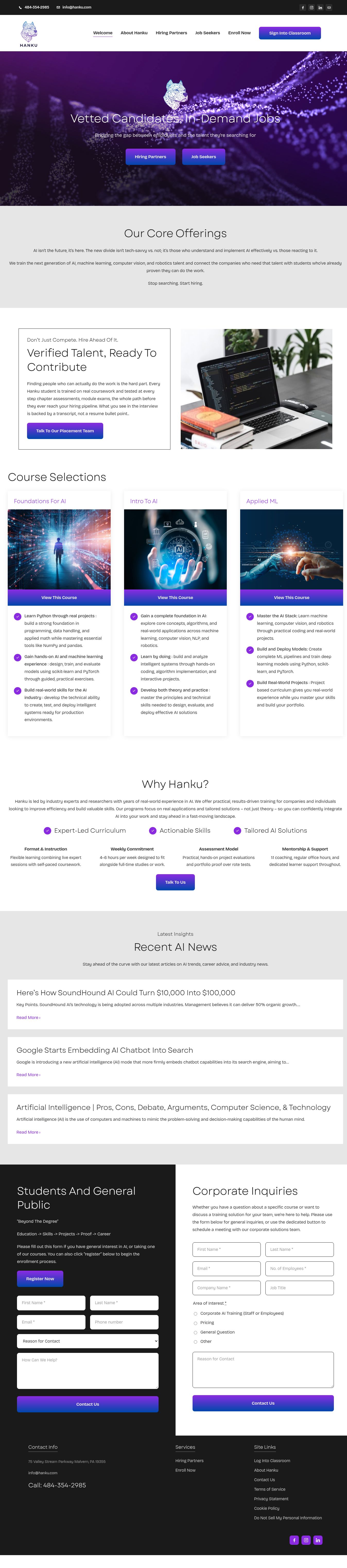
Project website capture · November 2026. The live site may evolve.
THE CHALLENGE
Complex subject.
Clear next step.
AI education serves people with very different questions. A learner needs to understand the learning path. An employer needs to see how the offering connects to talent and business needs.
The website’s job is to make those paths recognizable: explain the offer, organize the detail, and make the relevant next action easy to find.
OBJECTIVE / RELEVANCE BEFORE COMPLEXITY
PLANNING + UX
From information
to interaction.
SKETCH / AUDIENCE MAP
Who is this for?
Learner → explore courses → enrollment
Hiring partner → understand the offer → inquiry
WIREFRAME / HIERARCHY
What matters first?
A strong introduction, distinct pathways, focused course summaries, and contact points placed where questions arise.
RESPONSIVE / CONTINUITY
Keep the route clear.
Carry the same reading order and calls to action from wide layouts into a simple mobile stack.
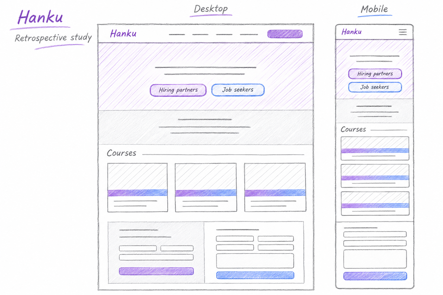
Retrospective UX study illustrating the page structure and responsive concept.
VISUAL IDENTITY
Signal. Contrast.
Recognition.
Hanku’s geometric mark and purple-to-blue palette establish a technical personality. Dark surfaces give the color room to stand out; neutral sections keep detailed information readable.
EXISTING HANKU BRAND / WEBSITE EXPRESSION
Purple
#8A2BE2
Blue
#0047AB
Charcoal
#1A1A1A
Light gray
#E6E6E6
Garet / Bricolage Grotesque
Live-site typography: Garet headings and Bricolage Grotesque body copy. Type names are shown as labels.
WHAT RUBI DELIVERED
A website built
around the journey.

Structure that guides.
A clear website hierarchy for learner and employer audiences, with course information and inquiry routes organized around their different needs.
A consistent visual language.
Responsive page layouts, a coordinated color system, and prominent calls to action carry Hanku’s identity across its public website.
Explore Hanku.
Discover the client’s learning and employer offerings.
THE RUBI ADVANTAGE
Technical credibility.
Human clarity.
The strongest technology websites make their value understandable. This approach pairs a distinctive AI identity with audience-specific routes, readable information, and purposeful next steps.