
CA ENGINEERING / BRAND + DIGITAL EXPERIENCE
Expertise.
Built to be seen.
A clear digital foundation for a multidisciplinary engineering firm.
RUBI organized a technical offering into a recognizable brand experience—connecting services, industries and locations with a direct route to start a project.
WEB DESIGN · BRAND EXPRESSION · CONTENT ARCHITECTURE

PROJECT FOCUS
Capability.
Clarity.
Connection.
An engineering website designed to support informed conversations.
STRUCTURE / SYSTEM
● ● ● engineerca.com
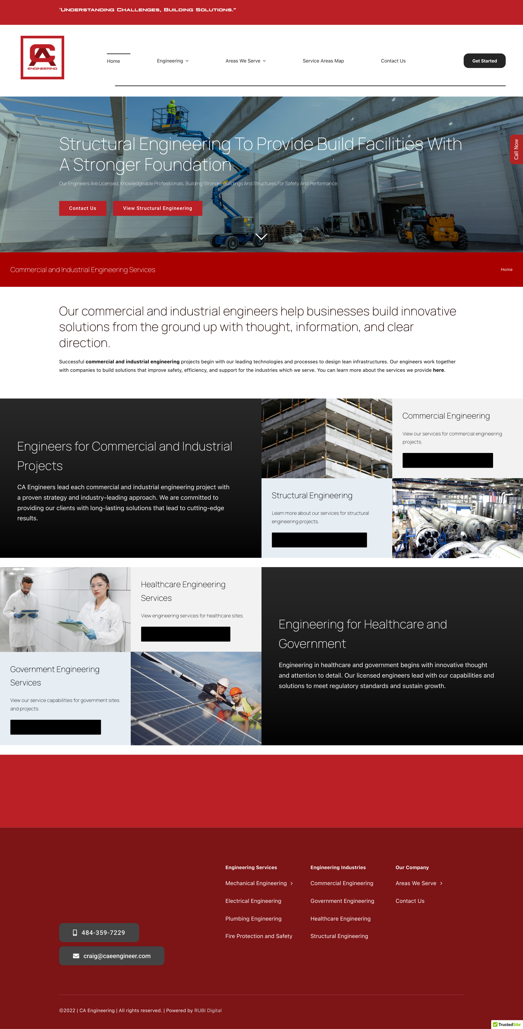
THE CHALLENGE
Make technical
expertise easy
to understand.
Owners, architects and facilities teams need to answer three questions quickly: Can this firm address my project? Does it understand my sector? Can it serve my location?
A website that supports the decision.
The objective was to give a broad engineering offering a clear hierarchy. Discipline pages explain the work, industry pages establish context, and service-area navigation helps visitors find the right geographic information.
Commercial and public-sector audiences can enter through different needs while sharing a consistent brand and contact experience.
PLANNING & UX
A blueprint for
better discovery.
A retrospective diagram of the site’s information architecture: from the visitor’s project need to a relevant service, location and inquiry.
SKETCH / THE QUESTIONS
What do you need?
Service → Industry → Location
Start with the buyer’s task and establish the shortest path to useful detail.
WIREFRAME / THE ORDER
Build the hierarchy.
Introduction
↓
Capabilities + related services
↓
Contact the team
Repeat a recognizable page structure across the offering.
RESPONSIVE / THE PRIORITY
Keep the next step close.
On smaller screens, a single reading order keeps service information and contact links easy to follow.
These diagrams explain the design approach; they are not original workshop artifacts.
VISUAL IDENTITY
Precision with
a recognizable signature.
The geometric CA monogram establishes a compact, memorable signature. Red carries that recognition into buttons and section bands; charcoal, white and cool neutrals give technical content room to breathe. The result feels structured and professional without losing personality.
Engineering red
#BB2026
Charcoal
#262626
Cool neutral
#E8EDF0
White
#FFFFFF
Aa / Manrope
A clean geometric heading system balances the angular logo with legible, spacious titles. The live website also uses Plateia Bold for its signature line and straightforward sans-serif text for navigation and body content.
DELIVERABLES
Designed around
real project needs.
A coherent brand experience
Consistent color, typography, image treatment and navigation make the firm recognizable across the site.
Service and industry architecture
Dedicated paths for mechanical, electrical, plumbing and fire-protection services, with further detail for HVAC and BIM/energy modeling. Sector pages connect capabilities with commercial, healthcare and government contexts.
Geographic discovery
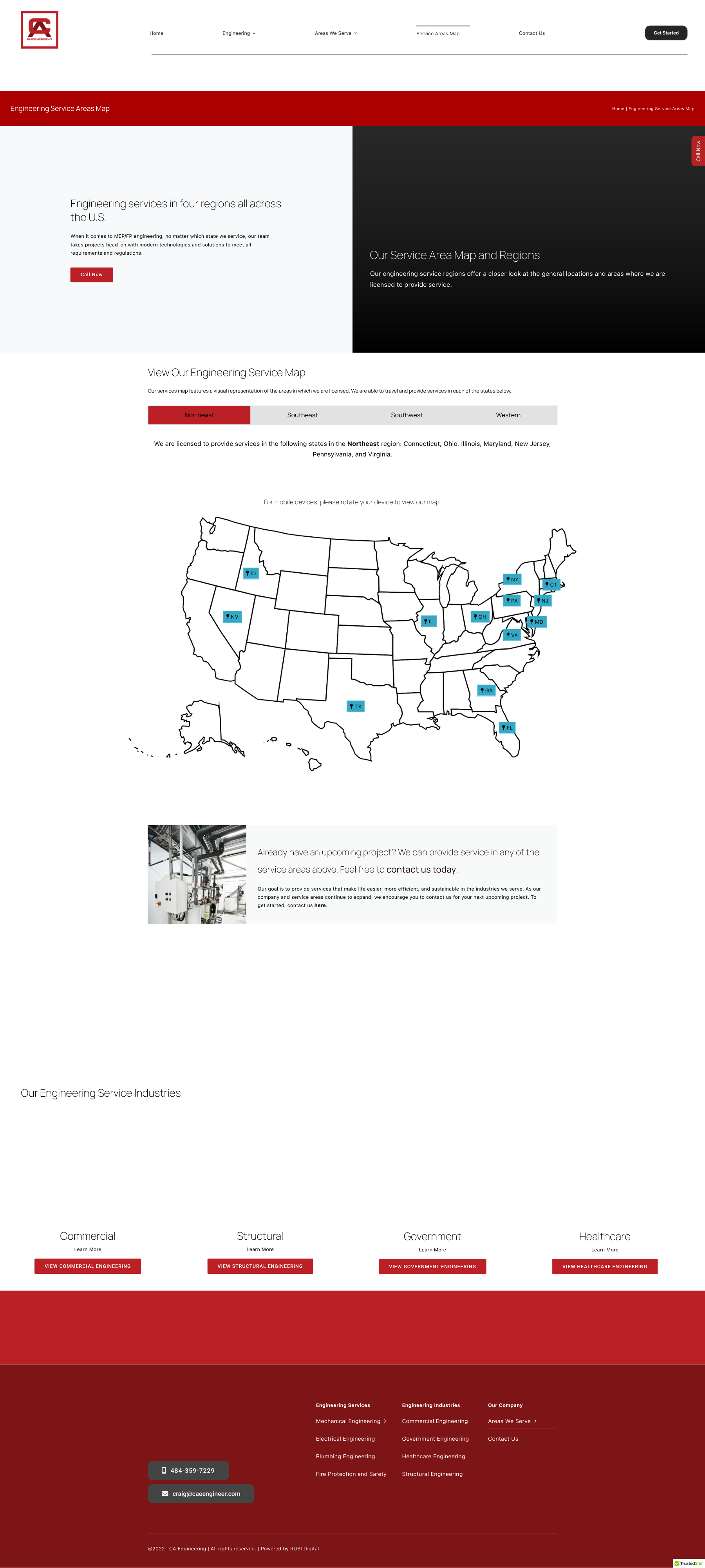
A service-area map and location pages provide a useful entry point for geographically specific inquiries.
COMMERCIAL → PUBLIC SECTOR
A foundation for
the next opportunity.
The website’s commercial value is practical: buyers can explore relevant services, see the industries addressed and make contact with a clearer brief.
Its government-facing value is a dedicated place to explain facilities and building-system capabilities to public-sector visitors. This supports early discovery and introductions; procurement qualifications and contract eligibility require separate evidence.
Explore CA Engineering
COMPETITIVE ADVANTAGE
Clarity is a
business asset.
Engineering firms compete on technical fit, relevant experience and trust. Strong websites make services, markets and supporting evidence easy to evaluate.
RUBI’s approach brings the first part of that evaluation into focus: a recognizable identity and connected service, sector and location pathways. The website becomes a useful business-development tool, ready to support stronger project stories as the firm grows.