
NONPROFIT / BRAND IDENTITY + WEBSITE
Care, made
visible.
Community Youth & Women’s Alliance
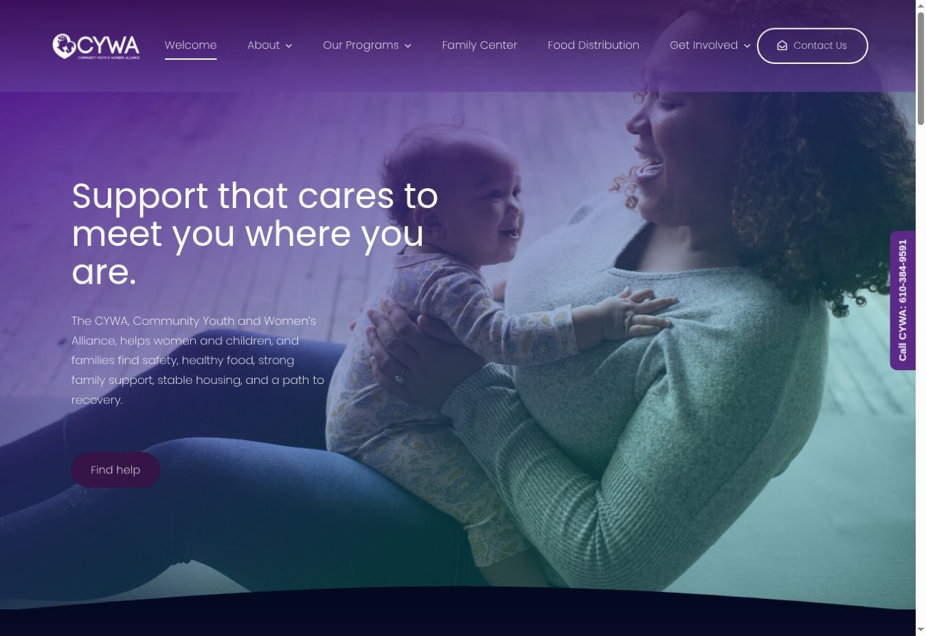
An original logo and a new digital home for a community organization supporting women, children and families in Coatesville.
LOGO DESIGN · BRAND SYSTEM · WEB DESIGN · CONTENT
A recognizable symbol of care.
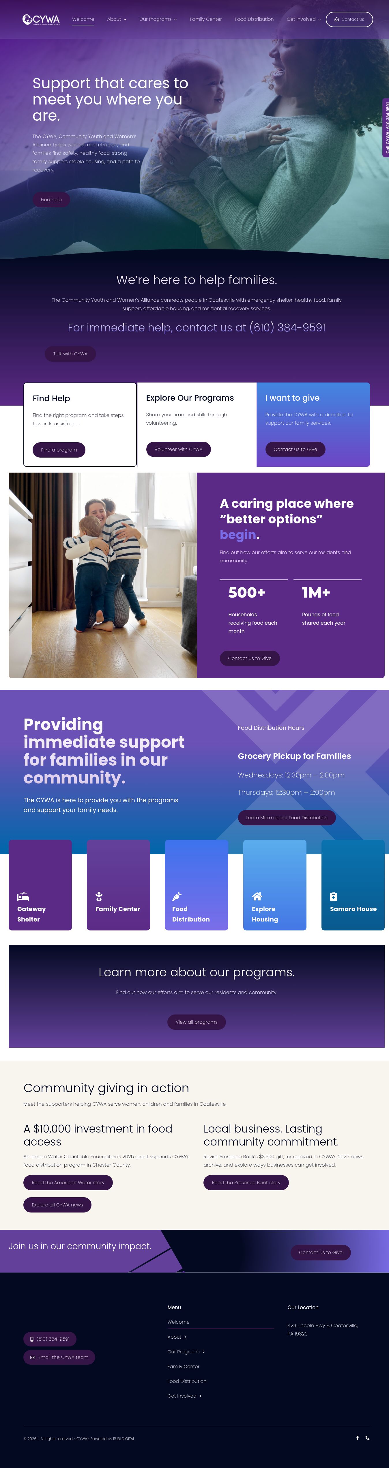
A consistent home for every program.
A HOME FOR HOPE
● ● ● cywa.org
THE CHALLENGE
One mission.
Different needs.
Someone seeking shelter needs a next step. A family seeking food needs practical information. A prospective donor needs to understand the work. The website must serve each visit with clarity and dignity.
Find help. Offer help.
Our approach connects a warm, identifiable brand with direct program navigation and visible contact routes.
PLANNING & UX
From purpose
to pathways.
The supplied design study establishes three primary journeys: finding support, volunteering, and giving. The final site carries those journeys into a consistent program system.
Planning reference and retrospective layout studies shown below.
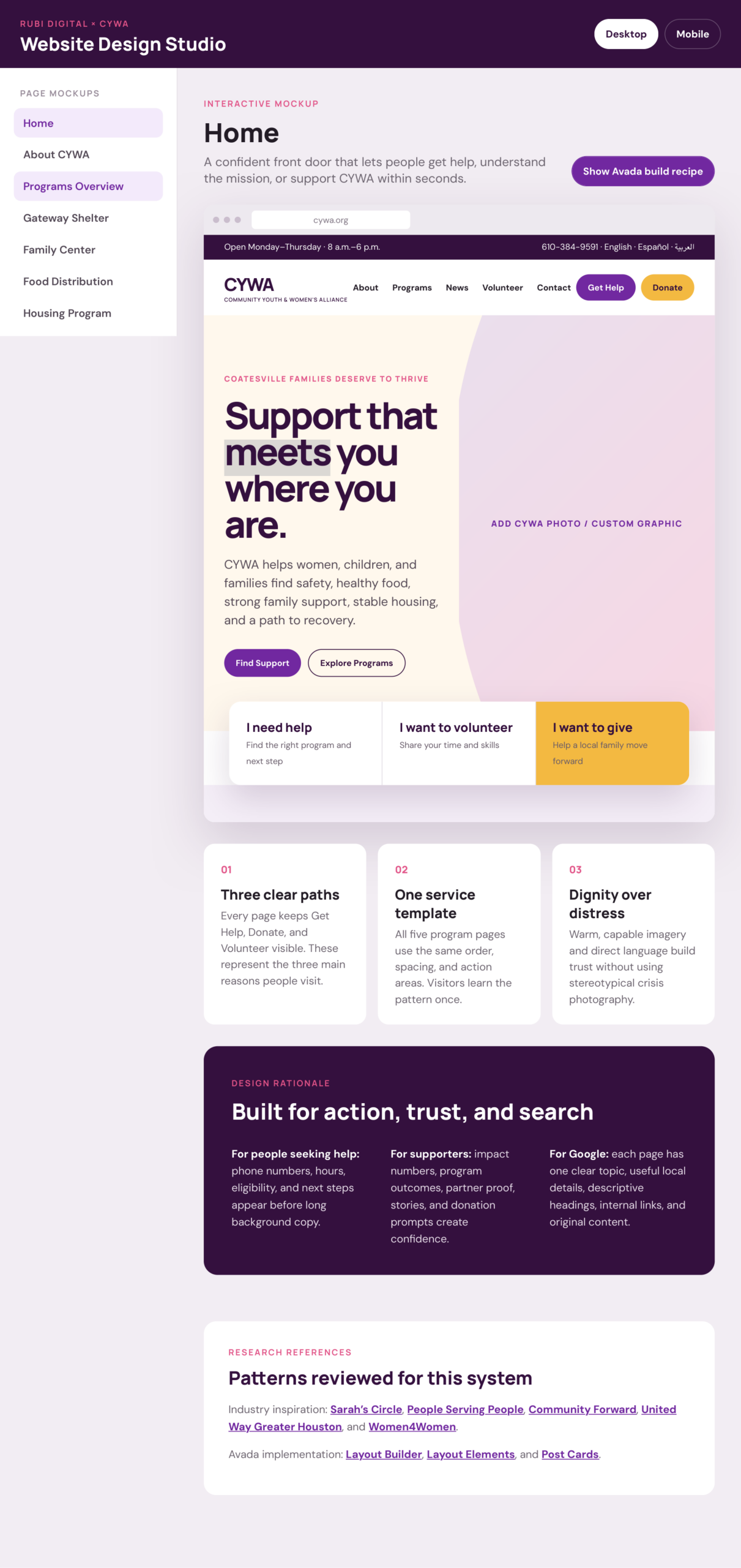
SKETCH → WIREFRAME → RESPONSIVE CONCEPT
Sketch the journeys
Find support → choose a program → contact CYWA. Support the mission → volunteer or give.
Wireframe the priorities
Place immediate actions first, program choices next, and community stories after essential information.
Adapt the experience
Stack program cards and actions into a clear reading order, with readable text and direct contact links.
VISUAL IDENTITY / ORIGINAL LOGO DESIGN
A mark of
belonging.
The parent-and-child silhouette and lotus create an immediate visual connection to care and growth. The horizontal signature and standalone emblem give the identity flexibility across the website.

Mission purple
#5B2A86
Lavender
#7B6DE8
Deep ink
#040922
Warm neutral
#F8F5EF
Aa / Poppins
Rounded, approachable letterforms for headlines and everyday reading. The live website pairs Poppins with Montserrat for selected numerical highlights. Purple leads; pale backgrounds create breathing room.
DELIVERABLES
Identity meets
everyday action.
Logo & visual language
Original logo design, horizontal and stacked arrangements, and a purple-led visual identity.
A new website
Program navigation, coordinated page sections, community stories, and visible ways to contact or support CYWA.
Content with a purpose
Service-focused headings, local context and internal links help visitors move from a broad need to useful information.
Explore CYWA’s work
COMPETITIVE ADVANTAGE
Recognition.
Reassurance.
A next step.
The strength of this project is the connection between brand and usability: a recognizable identity, a consistent program structure, and direct routes for people seeking support or offering it.
For CYWA, the website becomes a practical extension of the mission. For RUBI, it demonstrates how logo design and digital design can work as one system.