
ROSA.NYC / COMMUNICATION + LEARNING
Room to learn.
Space to thrive.
A welcoming digital home for a personal approach to communication, academics, and executive function support.
Content organization · Website design · Responsive UX

A more personal
first impression.
THE WEBSITE / FULL-LENGTH HOMEPAGE
● ● ● rosa.nyc
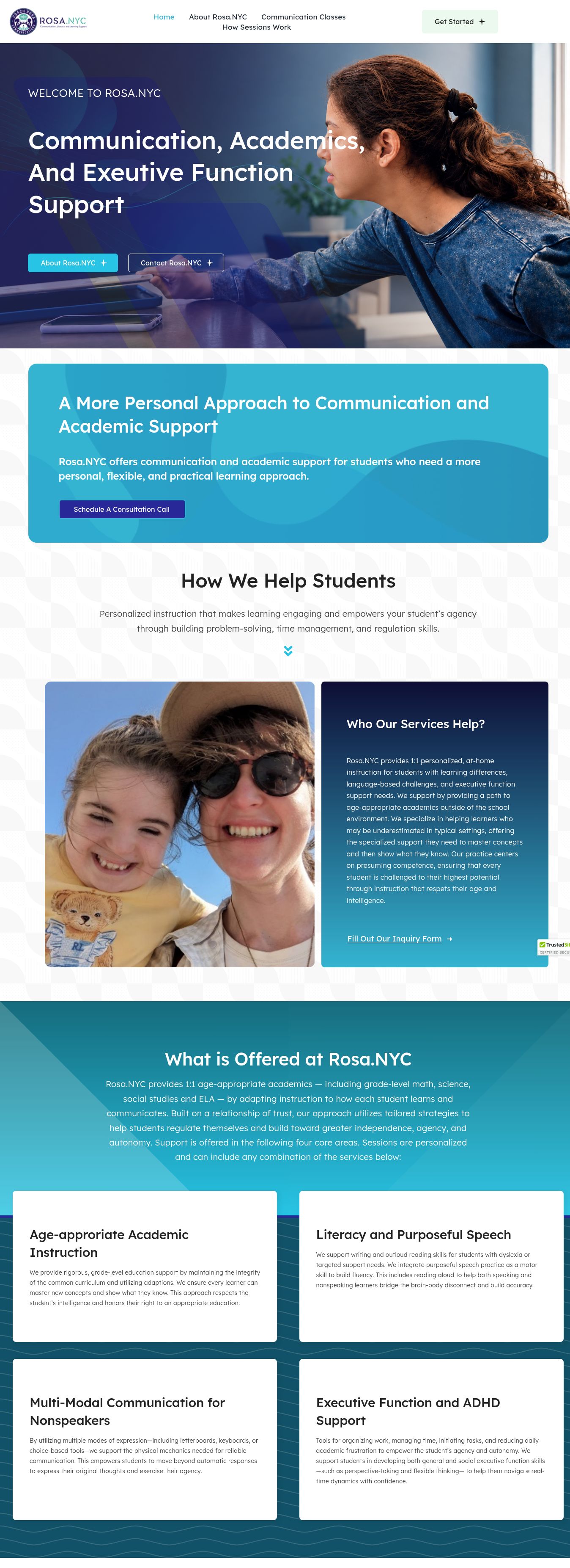
Website capture · November 2026. The live site may change.
THE CHALLENGE
Make understanding
feel easier.
Families need to understand the support available, the approach behind it, and how to begin. The website needs to make that information approachable without losing the detail that helps people make an informed inquiry.
Our design focus: turn dense information into a clear reading journey, give each service room to breathe, and keep contact options close to the information they support.
PLANNING + UX
Clarity, by design.
Listen.
Start with a family’s questions: who the support is for, what is offered, and what a first step looks like.
Organize.
Group related information into concise sections, service cards, and a visible getting-started sequence.
Connect.
Keep headings, buttons, and reading order consistent across desktop and smaller screens.
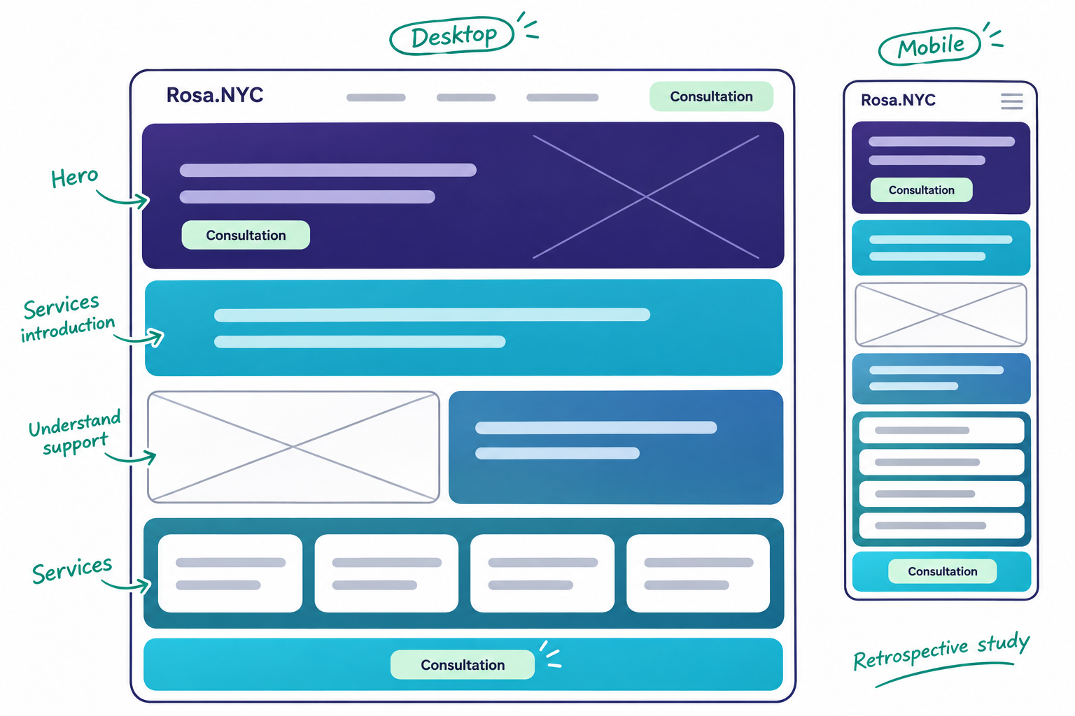
Retrospective planning study: page hierarchy → wireframe → responsive concept.
VISUAL IDENTITY
Calm color.
Confident presence.
Aqua and teal make the presentation feel open and clear. Indigo provides contrast, while pale mint creates quieter spaces around important information.
A distinct communications and learning identity.
Deep teal
#115268
Aqua
#27C4E5
Indigo
#292899
Pale mint
#ECF9EE
Lexend
The live website uses Lexend across headings and body text. Its open forms complement the generous spacing and rounded content panels. Typeface name shown as a label.
WHAT RUBI DELIVERED
A thoughtful route
from interest to inquiry.
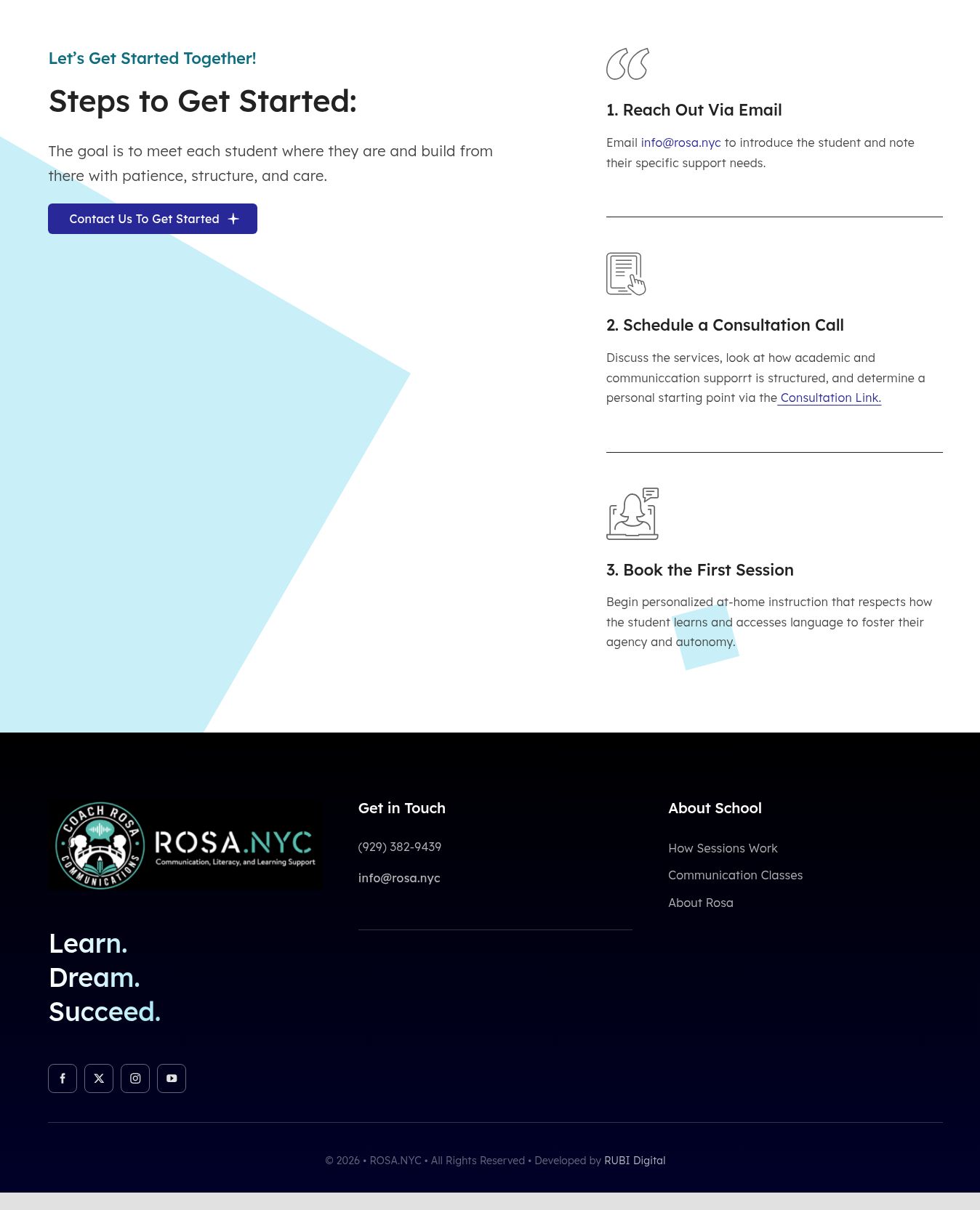
A clear introduction to the next steps.
Content with a clear hierarchy.
Existing information reorganized into readable sections with descriptive headings and related links.
A consistent page system.
Responsive layouts, rounded panels, coordinated colors, and native Avada components support a coherent experience across the site.
Helpful paths to the client.
Service information and inquiry options give visitors a practical way to continue their conversation with Rosa.NYC.
THE RUBI ADVANTAGE
Designed for people.
Built for understanding.
A service website should reflect the care behind the work. This approach brings warmth, clear information, and purposeful navigation together—helping visitors understand the offer and find their next step.